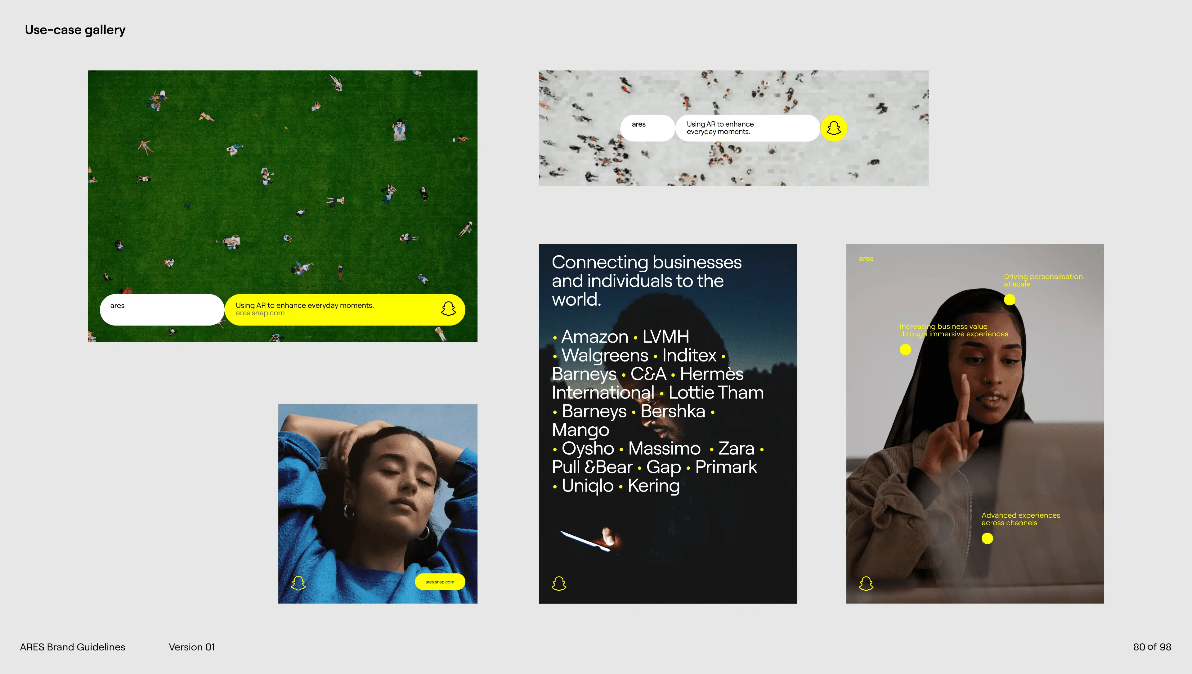
ARES — Snap Inc.

ARES — Snap Inc.

Designing the design system behind Snap's AR for enterprise.

Designing the design system behind Snap's AR for enterprise.

Designing the design system behind Snap's AR for enterprise.

Figma + variables
design tokens
Storybook
Tailwind
MCP-ready handoff

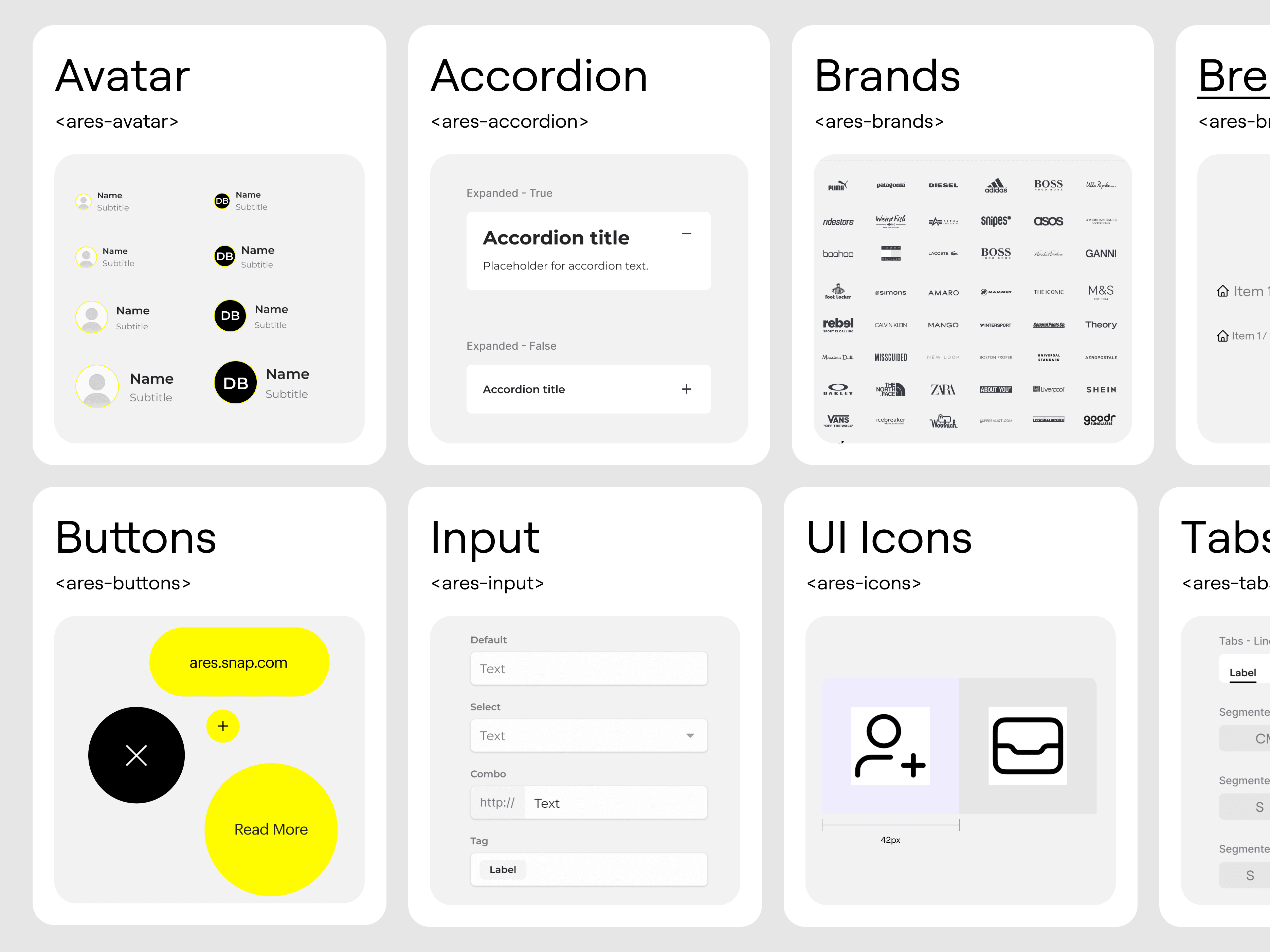
Designed and shipped a token-driven design system that gave Snap's enterprise AR teams a single source of truth across product, marketing, and partner-facing surfaces — replacing three disconnected design languages with one, and cutting the time from Figma to production by more than half.

Industry

Enterprise SaaS · Augmented Reality

Stack

Figma + variables, design tokens, Storybook, Tailwind, MCP-ready handoff

The Problem

By the time I came in, ARES was three things wearing one logo. The product surfaces, the partner-facing portal, and the marketing site each had their own design language — different type ramps, different button styles, different ideas about what the brand was supposed to feel like. The work was excellent in places, but it didn't add up to a system.

The deeper problem wasn't visual. It was structural. There was no shared contract between design and engineering. Every new surface meant a fresh round of decisions: which primary blue, which spacing scale, which radius. Engineers were re-implementing the same components in slightly different ways across repositories. Designers couldn't tell whether a new variant was a real addition or a duplicate.

What the team needed wasn't a fresh coat of paint. It was a system that absorbed what already worked, named it precisely, and gave product, brand, and partner teams a way to ship in parallel without diverging.


Designed and shipped a token-driven design system that gave Snap's enterprise AR teams a single source of truth across product, marketing, and partner-facing surfaces — replacing three disconnected design languages with one, and cutting the time from Figma to production by more than half.
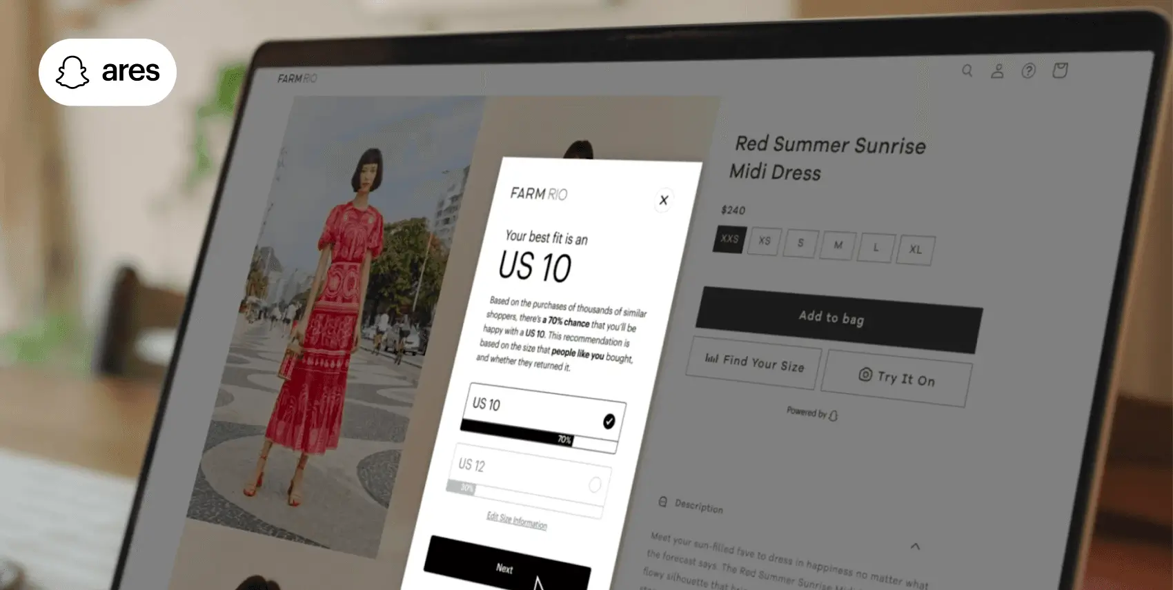
Unifying ARES with Fit Analytics under one design system

Unifying ARES with Fit Analytics under one design system — brand consistency across product, marketing, and partner-facing surfaces.
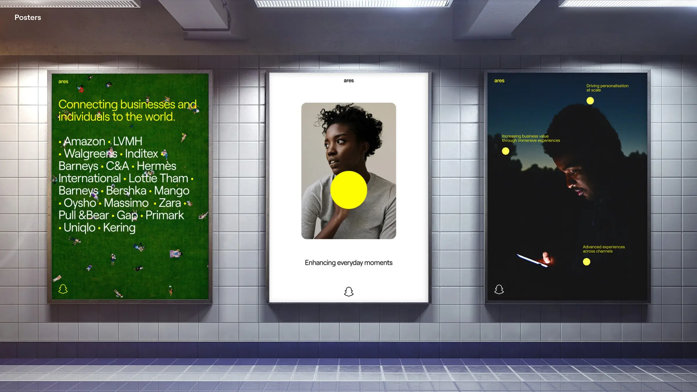
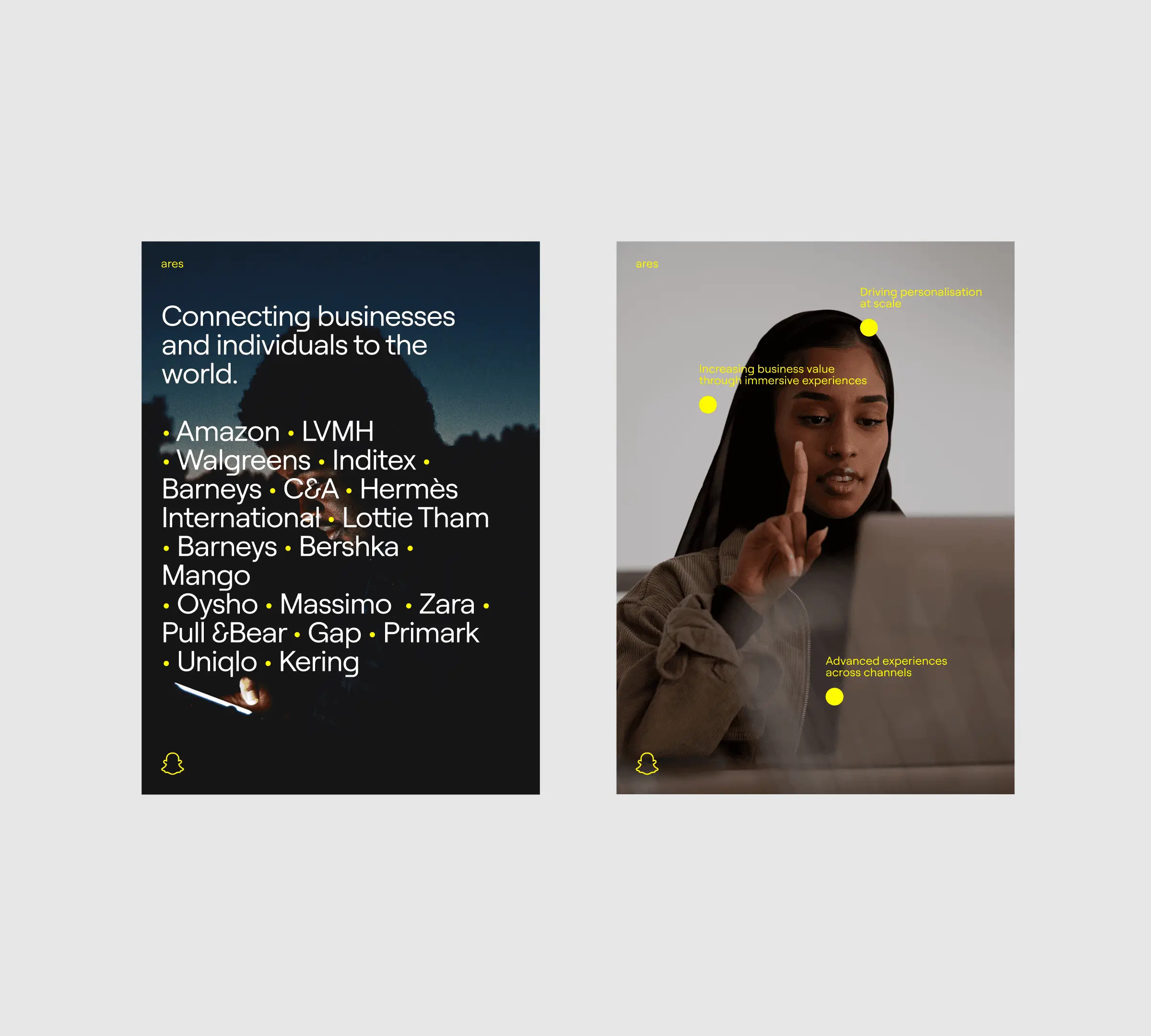
ARES brand metaphor — fostering experiences and connections

A metaphor for what ARES does — fostering experiences and connections between individuals and businesses, where the whole is greater than the sum of its parts.

Cross-functional collaboration on ARES — technology, design, shared language

Cross-functional collaboration in practice — advanced technology, customer-centric design, and one shared design language.

How I Framed It

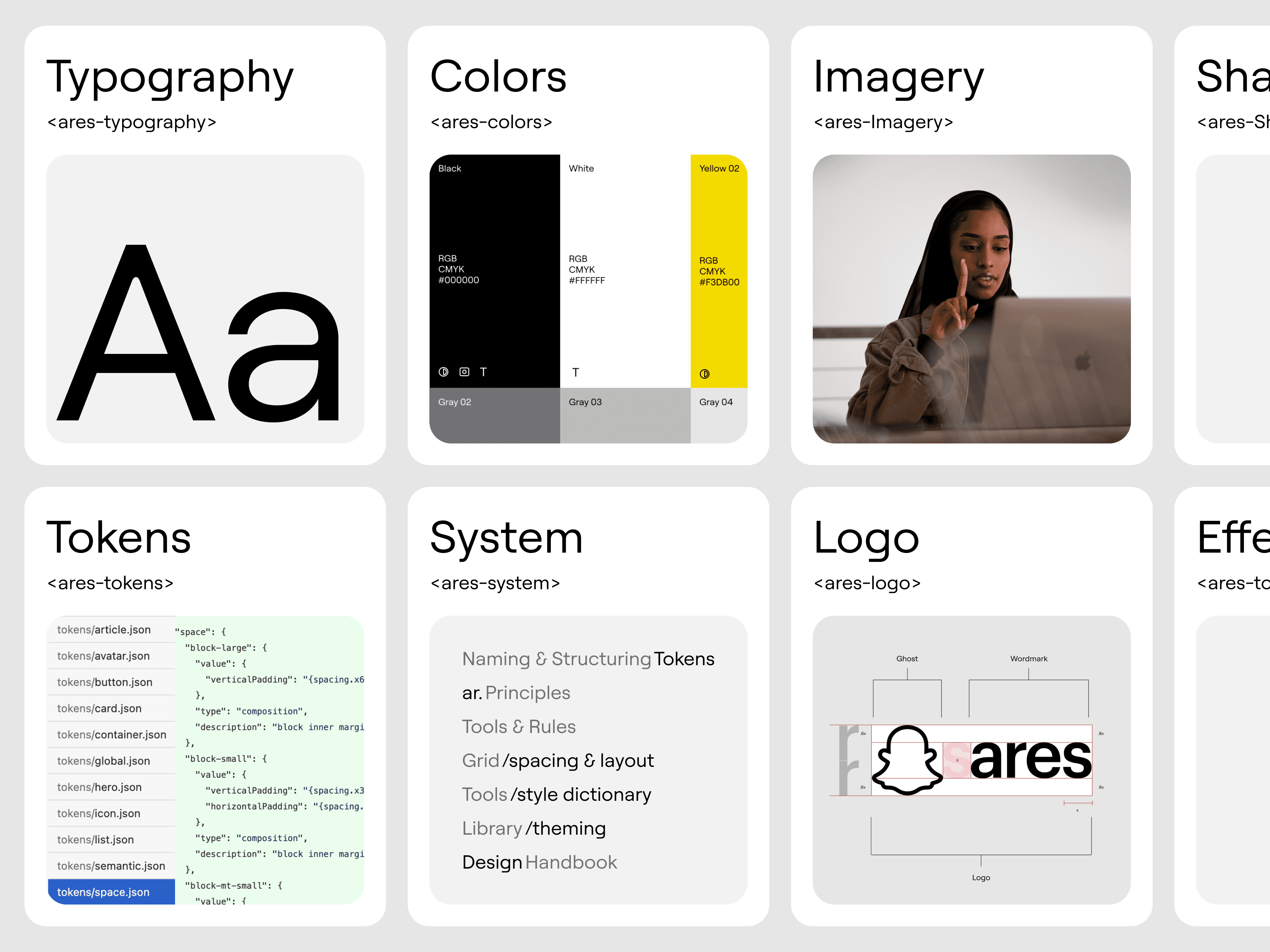
I organised the work in three layers, and made each one independently usable so different teams could adopt at different speeds.

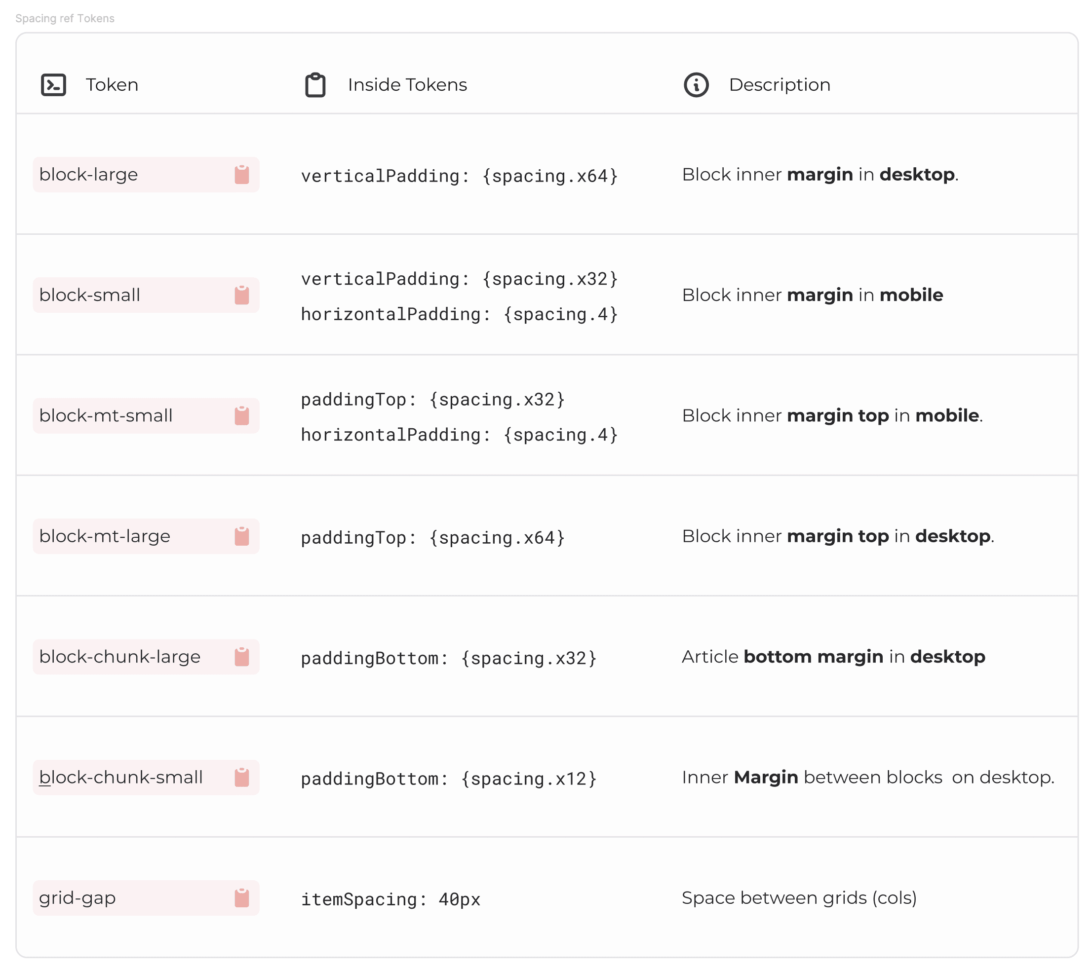
Layer 1 — Primitive tokens. Raw color ramps, type scale, spacing scale, motion curves. Named without semantic meaning so they can be remixed in dark mode, partner co-branding, or launch theming without breaking downstream.

Layer 2 — Semantic tokens. surface/primary, text/muted, accent/brand, radius/control. These are the names product designers think in. They map onto primitives and they're the only layer components reference.

Layer 3 — Component contracts. Each component published in Figma is matched 1:1 by a contract document spelling out anatomy, props, states, accessibility notes, and the exact token slots it consumes. The contract is the spec engineering builds against — not the Figma file.

The insight here is that the system doesn't live in any one of the three layers. It lives in the boundary between them. Primitives shouldn't leak into components; components shouldn't bypass semantic tokens. Once that discipline holds, the system maintains itself.


Key Decisions

Treat brand and product as the same system, not siblings

Context: The temptation is always to split brand and product into separate systems with a vague handshake between them.

Choice: I built one token foundation that both consumed. The brand site uses the same accent/brand token as the product header. When the brand evolves, both move at once.

Trade-off: The brand team gave up some artistic latitude. The product team accepted more typography rules than they initially wanted. Both were worth it.

Hand off contracts, not Figma files

Context: Engineers were inferring component behaviour from Figma frames, which always loses something in translation.

Choice: Every component shipped with a written contract document — props, states, edge cases, accessibility notes, token usage. Engineering built against the contract; the Figma file was reference material, not source.

Trade-off: Slower upfront. Forces the designer to think through every state, including the ones nobody draws.

Make the system MCP-ready from day one

Context: Snap was investing in AI-assisted workflows. A design system only humans could read would be a ceiling on that investment.

Choice: Token names, component contracts, and the Figma library were structured so they could be consumed programmatically — by Cursor, by Figma's MCP server, by any future agent that needed to know what accent/brand resolved to in a given theme.

Trade-off: Required more rigorous naming discipline than a human-only system would. Paid off the first time an agent generated a correct component variant from a contract alone.

Brand identity that earned its place inside the product

Context: Enterprise AR is unfamiliar territory for most buyers. The brand had to feel credible, not novel.

Choice: A confident, slightly editorial typographic system anchored by a restrained colour palette. The visual language reads as serious software first and AR-native second — because that's the order buyers care about.

Trade-off: Less viral, more durable.


How I Framed It

I organised the work in three layers, and made each one independently usable so different teams could adopt at different speeds.

Layer 1 — Primitive tokens. Raw color ramps, type scale, spacing scale, motion curves. Named without semantic meaning so they can be remixed in dark mode, partner co-branding, or launch theming without breaking downstream.

Layer 2 — Semantic tokens. surface/primary, text/muted, accent/brand, radius/control. These are the names product designers think in. They map onto primitives and they're the only layer components reference.

Layer 3 — Component contracts. Each component published in Figma is matched 1:1 by a contract document spelling out anatomy, props, states, accessibility notes, and the exact token slots it consumes. The contract is the spec engineering builds against — not the Figma file.

The insight here is that the system doesn't live in any one of the three layers. It lives in the boundary between them. Primitives shouldn't leak into components; components shouldn't bypass semantic tokens. Once that discipline holds, the system maintains itself.


Key Decisions

Treat brand and product as the same system, not siblings

Context: The temptation is always to split brand and product into separate systems with a vague handshake between them.

Choice: I built one token foundation that both consumed. The brand site uses the same accent/brand token as the product header. When the brand evolves, both move at once.

Trade-off: The brand team gave up some artistic latitude. The product team accepted more typography rules than they initially wanted. Both were worth it.

Hand off contracts, not Figma files

Context: Engineers were inferring component behaviour from Figma frames, which always loses something in translation.

Choice: Every component shipped with a written contract document — props, states, edge cases, accessibility notes, token usage. Engineering built against the contract; the Figma file was reference material, not source.

Trade-off: Slower upfront. Forces the designer to think through every state, including the ones nobody draws.

Make the system MCP-ready from day one

Context: Snap was investing in AI-assisted workflows. A design system only humans could read would be a ceiling on that investment.

Choice: Token names, component contracts, and the Figma library were structured so they could be consumed programmatically — by Cursor, by Figma's MCP server, by any future agent that needed to know what accent/brand resolved to in a given theme.

Trade-off: Required more rigorous naming discipline than a human-only system would. Paid off the first time an agent generated a correct component variant from a contract alone.

Brand identity that earned its place inside the product

Context: Enterprise AR is unfamiliar territory for most buyers. The brand had to feel credible, not novel.

Choice: A confident, slightly editorial typographic system anchored by a restrained colour palette. The visual language reads as serious software first and AR-native second — because that's the order buyers care about.

Trade-off: Less viral, more durable.


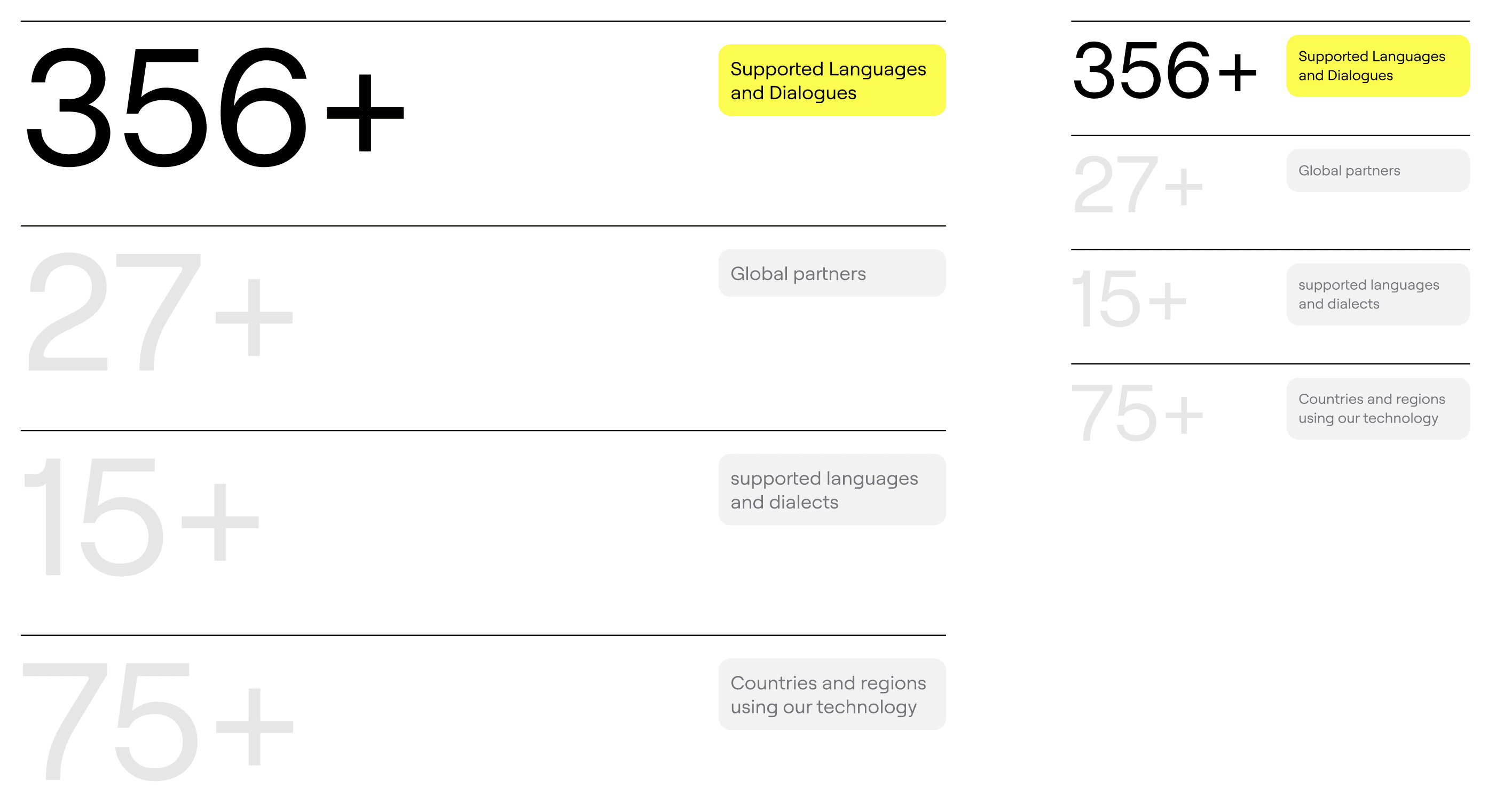
ARES visual tropes — play, progress, magic

Visual tropes — juxtaposition of play and progress, suggestive of "magic," with propulsive animations inspired by electricity.
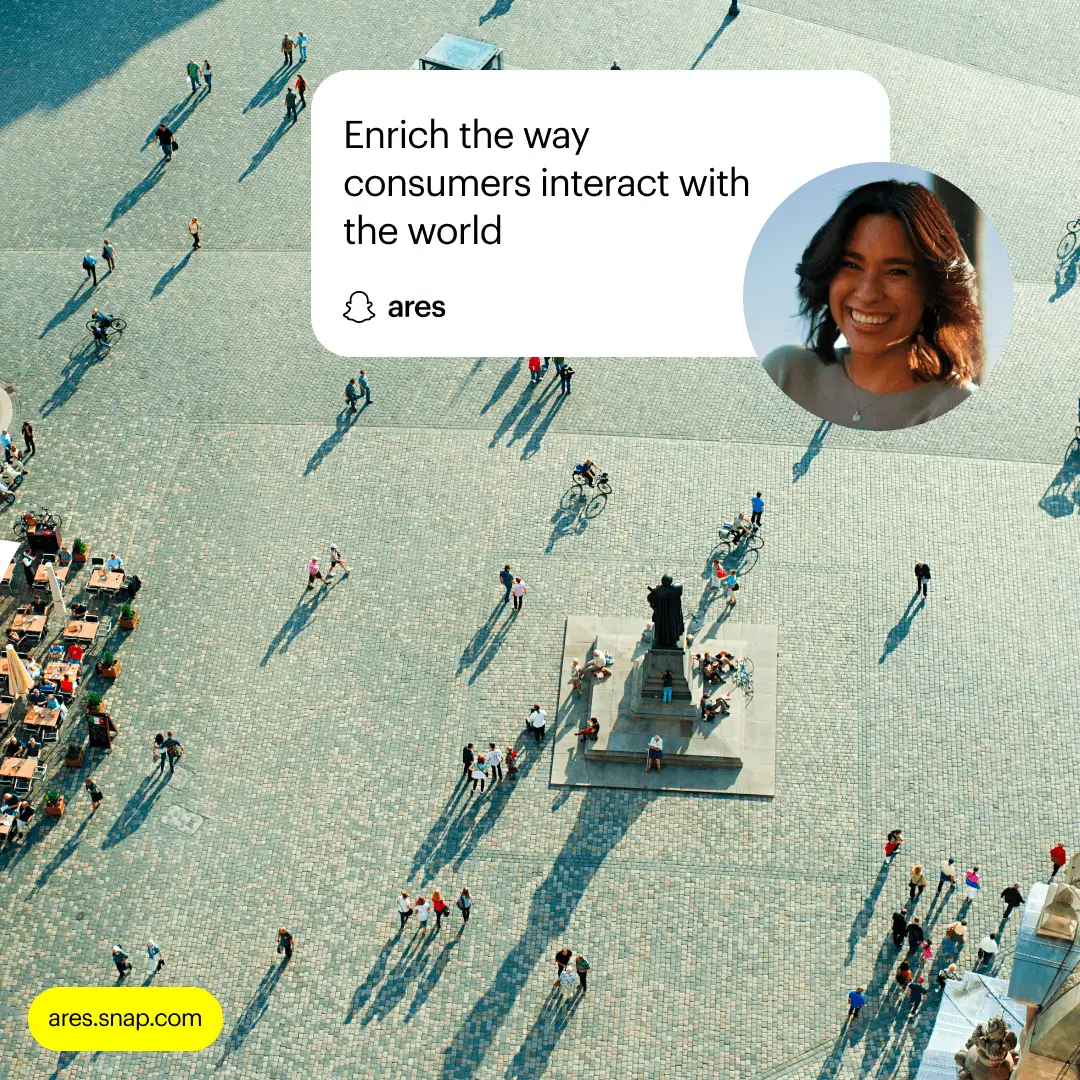
ARES brand identity in motion

Brand identity in motion — typographic system anchored to the launch surface.

What Shipped

A full design system covering the foundations layer (color, type, spacing, motion, elevation), the semantic tokens that sit on top, and a component library covering the surfaces ARES needed to launch — navigation, forms, data tables, content surfaces, marketing modules, and partner-facing dashboards.

Alongside the system, a refreshed brand identity covering logo lockups, typography pairing, photography direction, and the launch-site design that introduced ARES to the market.


Brand Identity

A confident, slightly editorial typographic system anchored by a restrained colour palette — built so the brand reads as serious software first and AR-native second. The visual language earned its place inside the product because enterprise buyers care more about credibility than novelty.
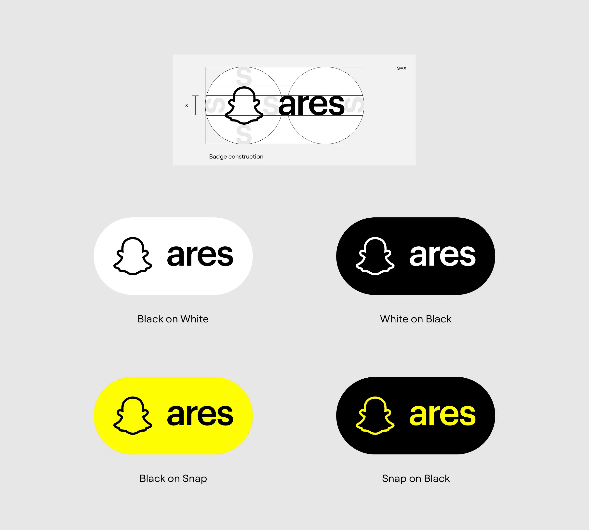

ARES brand mark geometric reduction

Brand mark exploration — geometric reduction of the ARES form.
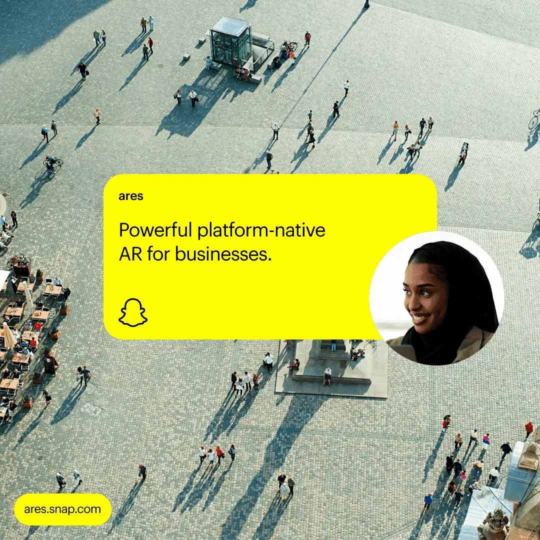
ARES colour palette study and primary surface treatment

Visual exploration — colour palette study and primary surface treatment.

ARES feature overview — product detail page, AR try-on, and mobile commerce surfaces built on the shared token foundation
ARES — Snap Inc. Augmented Reality Enterprise Services
ARES brand mark

Result

The system became the shared substrate for the launch. Marketing, product, and partner-facing teams all built on the same foundation, in parallel, without the usual round of late-stage visual reconciliation. New surfaces shipped in days where they previously took weeks, and the design system was adopted as the canonical reference for engineering.

More importantly, the structure held up under change. When the brand evolved post-launch, the update propagated through every surface that consumed the semantic tokens — no manual sweep, no missed corners.

  • 3 → 1 — Design languages unified

  • Weeks → Days — Time to ship a new surface

  • Yes — System maintained itself under brand change


What I'd Do Differently

If I were starting again, I'd invest earlier in a Storybook published from the same source as the Figma library, with token visualisations rendered live. Engineers picked up the contracts quickly, but having a browsable component playground from week one would have saved a handful of clarification cycles in the first month.


What's Next

The foundation is built to keep moving. The roadmap includes deeper agent-assisted workflows that use the component contracts as the authoring surface — designers describe a new variant in language, the agent proposes the contract, the human approves, and the Figma + code update in lockstep. ARES is exactly the kind of product that should ship that way.

Result

The system became the shared substrate for the launch. Marketing, product, and partner-facing teams all built on the same foundation, in parallel, without the usual round of late-stage visual reconciliation. New surfaces shipped in days where they previously took weeks, and the design system was adopted as the canonical reference for engineering.

More importantly, the structure held up under change. When the brand evolved post-launch, the update propagated through every surface that consumed the semantic tokens — no manual sweep, no missed corners.

  • 3 → 1 — Design languages unified

  • Weeks → Days — Time to ship a new surface

  • Yes — System maintained itself under brand change


What I'd Do Differently

If I were starting again, I'd invest earlier in a Storybook published from the same source as the Figma library, with token visualisations rendered live. Engineers picked up the contracts quickly, but having a browsable component playground from week one would have saved a handful of clarification cycles in the first month.


What's Next

The foundation is built to keep moving. The roadmap includes deeper agent-assisted workflows that use the component contracts as the authoring surface — designers describe a new variant in language, the agent proposes the contract, the human approves, and the Figma + code update in lockstep. ARES is exactly the kind of product that should ship that way.

ARES logo badge in partner co-branded contexts

Logo badge in partner co-branded contexts — compliance with brand guidelines, just as partners comply with theirs.
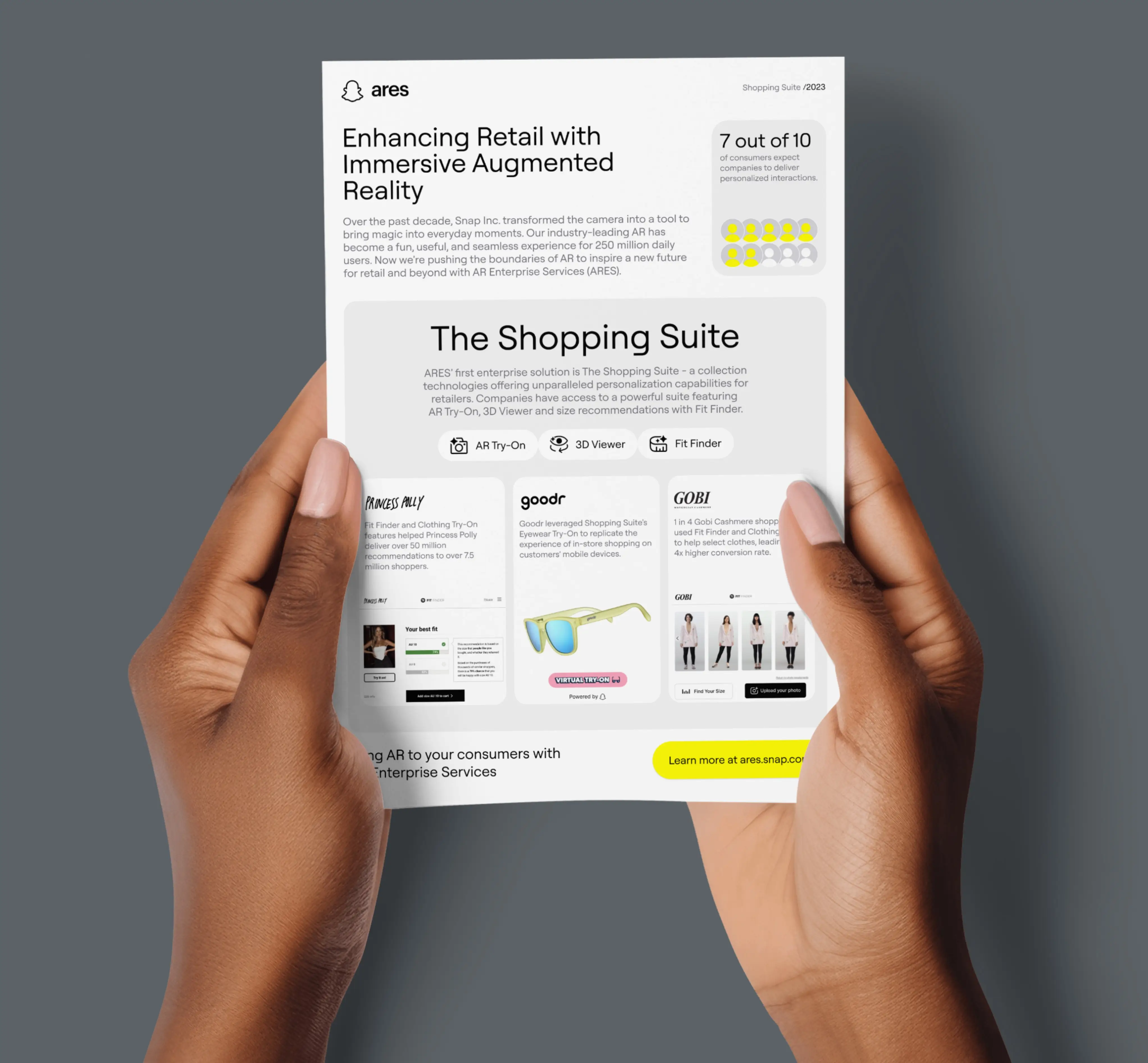
ARES launch surface

ARES launch surface — introducing the brand to market.
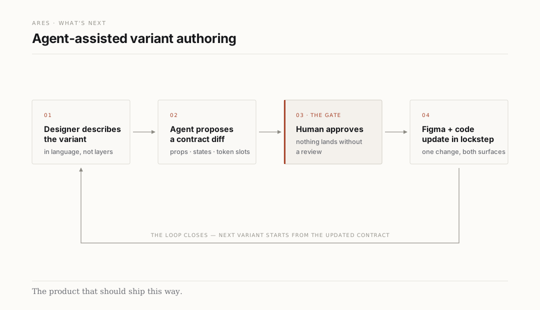
ARES agent-assisted variant authoring loop

Designers describe a variant in language; the agent proposes a contract diff; nothing lands without human review.
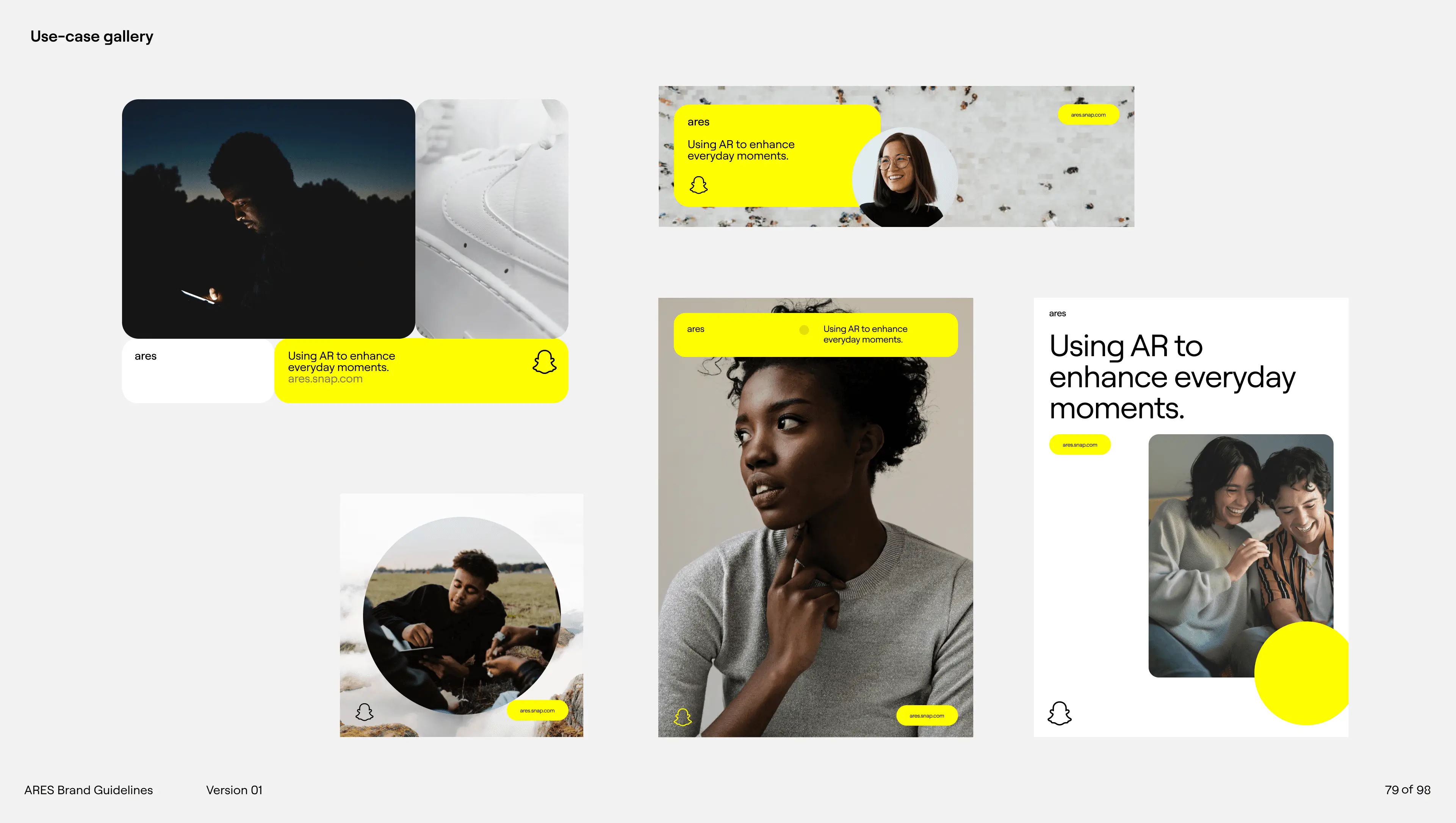
ARES project credits — Snap Inc., brand designer + design systems lead

More Projects

Creating Since 2010

I’m currently available for new work. Let me know if you need a digital designer. I’d love to talk about the next big thing!

© Molham.Works 2025