Measmerize

Measmerize

End-to-end product design and marketing site for an AI sizing tool used by Prada, Moncler, and 30+ luxury brands.

End-to-end product design and marketing site for an AI sizing tool used by Prada, Moncler, and 30+ luxury brands.

End-to-end product design and marketing site for an AI sizing tool used by Prada, Moncler, and 30+ luxury brands.

Figma
Protopie
Responsive web
AI product design

Designed and shipped a complete marketing website, interactive product prototypes, and Size Advisor UI refinements for an AI sizing platform now used by 30+ luxury fashion brands including Prada, Moncler, and Fendi — delivered in a four-week sprint alongside their product and marketing teams.

Industry

SaaS / AI / Fashion Technology

Stack

Figma, Protopie, Responsive web, AI product design

The Problem

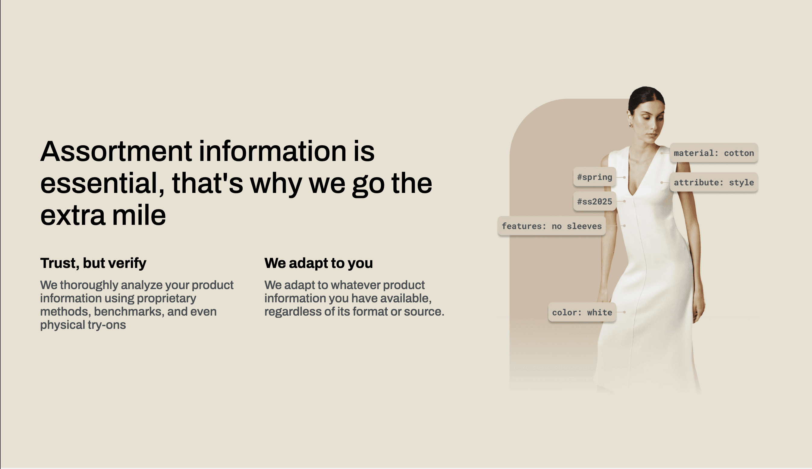
Measmerize had a strong product — an AI engine that predicts the right size for online shoppers using body data, SKU-level garment specs, and preference learning. Luxury brands like Prada and Moncler were already using it. But the public-facing story didn't match the sophistication of what was under the hood.

The existing website explained features but never made the technology feel tangible. Visitors landed, read a list of capabilities, and left without understanding how the recommendation actually worked or why it was different from a basic size chart. For a product whose entire value is reducing uncertainty, the marketing surface was creating more of it.

The Size Advisor UI itself — the widget that lives inside a brand's product page — needed refinement too. It was functional but hadn't been designed with the same care as the brands it served. When your widget sits next to Prada's product photography, the bar is different.


Designed and shipped a complete marketing website, interactive product prototypes, and Size Advisor UI refinements for an AI sizing platform now used by 30+ luxury fashion brands including Prada, Moncler, and Fendi — delivered in a four-week sprint alongside their product and marketing teams.
How I Framed It

I split the work into two parallel tracks that shared one design language.

Track 1 — The marketing site. The goal wasn't to describe features. It was to demonstrate the sizing logic visually — show visitors the journey from body scan to recommendation in a way that felt inevitable, not magical. Every section of the site maps to a step in the product's decision loop: data in, algorithm, confidence score, recommendation out. The structure of the page is the product explanation.

Track 2 — The product UI. The Size Advisor widget needed to feel native to any brand's product page while maintaining Measmerize's identity. That's a tension: too branded and it clashes with the host store; too neutral and it loses trust. I designed a system of subtle visual cues — typographic hierarchy, micro-interactions, and a restrained colour palette — that signals competence without competing with the brand it's embedded in.

Protopie prototypes bridged the two tracks. The marketing site prototypes demonstrated the sizing flow interactively for sales demos. The product UI prototypes tested the widget in context, embedded in mock product pages from actual client stores, so the team could evaluate fit before shipping.


Key Decisions

Show the algorithm, don't describe it

Context: The previous site listed features — “AI-powered,” “accurate from day one,” “customizable.” Accurate, but undifferentiated. Every sizing competitor says the same things.

Choice: I structured the homepage around the recommendation pipeline itself. Each scroll section corresponds to a stage: input capture, body model, garment data mapping, confidence scoring, recommendation. The visitor follows the logic instead of reading about it.

Trade-off: This requires more design and content work than a feature grid. It also means the page is longer. But for a product that sells on trust in its intelligence, showing the thinking is worth the scroll.

Design the widget as a guest, not a host

Context: The Size Advisor lives on someone else's product page. It needs to be visible enough to use but quiet enough not to disrupt the shopping experience.

Choice: A typographically-led UI with a near-white palette, no heavy borders, and interaction patterns borrowed from native e-commerce elements (drawers, inline expansions) rather than pop-ups or modals. The widget adapts its density based on the host page's context.

Trade-off: Less visual distinctiveness for Measmerize's brand inside the widget. But the product's job is to help the shopper buy confidently — not to advertise itself.

Protopie over static handoff for the sales demo

Context: The sales team was demoing the product with slides and a staging environment. Slides can't show interaction quality; staging environments break at the worst moment.

Choice: High-fidelity Protopie prototypes that simulate the full sizing flow — body input, processing animation, recommendation with confidence indicator. These run on any device, offline, and feel like the real product without depending on a live backend.

Trade-off: Protopie has a learning curve for the team maintaining the prototypes after handoff. I documented the interaction logic to reduce that friction.

One design language across marketing and product

Context: Marketing sites and product UIs often diverge visually because different people own them. Over time, that gap becomes a credibility problem — the website promises one experience, the product delivers another.

Choice: A shared type scale, colour system, and illustration style that carries from the homepage into the widget. The marketing site is more expressive; the widget is more restrained. But they're unmistakably the same family.

Trade-off: Constrains the marketing team's creative freedom slightly. Worth it for the coherence.


How I Framed It

I split the work into two parallel tracks that shared one design language.

Track 1 — The marketing site. The goal wasn't to describe features. It was to demonstrate the sizing logic visually — show visitors the journey from body scan to recommendation in a way that felt inevitable, not magical. Every section of the site maps to a step in the product's decision loop: data in, algorithm, confidence score, recommendation out. The structure of the page is the product explanation.

Track 2 — The product UI. The Size Advisor widget needed to feel native to any brand's product page while maintaining Measmerize's identity. That's a tension: too branded and it clashes with the host store; too neutral and it loses trust. I designed a system of subtle visual cues — typographic hierarchy, micro-interactions, and a restrained colour palette — that signals competence without competing with the brand it's embedded in.

Protopie prototypes bridged the two tracks. The marketing site prototypes demonstrated the sizing flow interactively for sales demos. The product UI prototypes tested the widget in context, embedded in mock product pages from actual client stores, so the team could evaluate fit before shipping.


Key Decisions

Show the algorithm, don't describe it

Context: The previous site listed features — “AI-powered,” “accurate from day one,” “customizable.” Accurate, but undifferentiated. Every sizing competitor says the same things.

Choice: I structured the homepage around the recommendation pipeline itself. Each scroll section corresponds to a stage: input capture, body model, garment data mapping, confidence scoring, recommendation. The visitor follows the logic instead of reading about it.

Trade-off: This requires more design and content work than a feature grid. It also means the page is longer. But for a product that sells on trust in its intelligence, showing the thinking is worth the scroll.

Design the widget as a guest, not a host

Context: The Size Advisor lives on someone else's product page. It needs to be visible enough to use but quiet enough not to disrupt the shopping experience.

Choice: A typographically-led UI with a near-white palette, no heavy borders, and interaction patterns borrowed from native e-commerce elements (drawers, inline expansions) rather than pop-ups or modals. The widget adapts its density based on the host page's context.

Trade-off: Less visual distinctiveness for Measmerize's brand inside the widget. But the product's job is to help the shopper buy confidently — not to advertise itself.

Protopie over static handoff for the sales demo

Context: The sales team was demoing the product with slides and a staging environment. Slides can't show interaction quality; staging environments break at the worst moment.

Choice: High-fidelity Protopie prototypes that simulate the full sizing flow — body input, processing animation, recommendation with confidence indicator. These run on any device, offline, and feel like the real product without depending on a live backend.

Trade-off: Protopie has a learning curve for the team maintaining the prototypes after handoff. I documented the interaction logic to reduce that friction.

One design language across marketing and product

Context: Marketing sites and product UIs often diverge visually because different people own them. Over time, that gap becomes a credibility problem — the website promises one experience, the product delivers another.

Choice: A shared type scale, colour system, and illustration style that carries from the homepage into the widget. The marketing site is more expressive; the widget is more restrained. But they're unmistakably the same family.

Trade-off: Constrains the marketing team's creative freedom slightly. Worth it for the coherence.


What Shipped

A fully redesigned marketing website that walks visitors through Measmerize's AI sizing logic — from data input to recommendation — with clear product explanations for each of the three core products: Size Advisor, Smart Size Chart, and Size Hub. The site serves both brand decision-makers evaluating the platform and developers assessing integration effort.

A refined Size Advisor widget UI designed to feel native on luxury e-commerce product pages, with careful typographic hierarchy and interaction patterns that don't compete with the host brand.

A set of high-fidelity Protopie prototypes used by the sales team for live product demos — interactive simulations of the complete sizing flow that run independently of the production backend.


Result

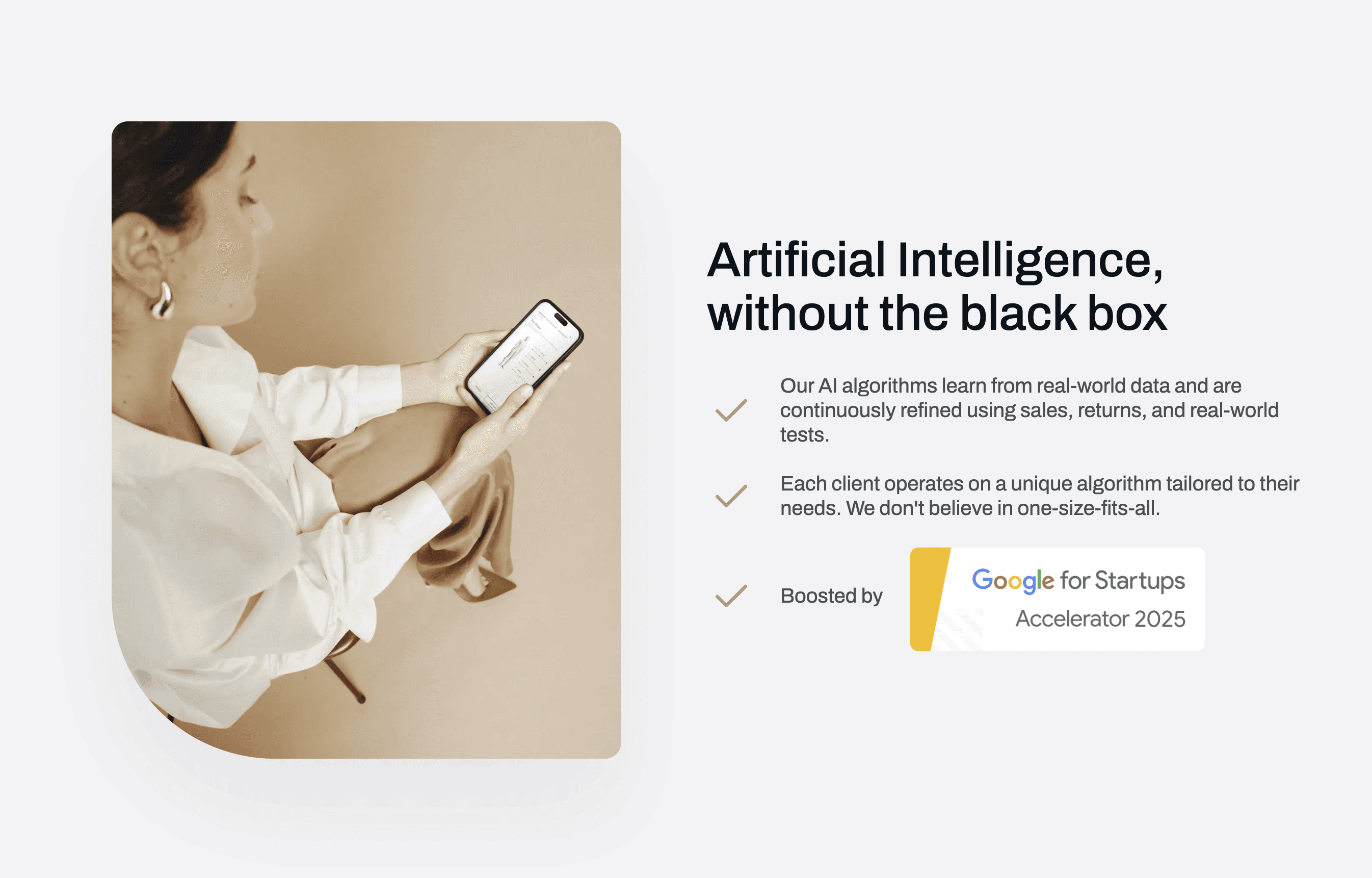
The redesigned website and product UI launched on measmerize.com. Measmerize continues to serve 30+ luxury and premium fashion brands — including Prada, Moncler, Fendi, Golden Goose, Lanvin, and Zegna — and was selected for the Google for Startups AI Accelerator in 2025 (15 companies chosen from over 1,000 applicants).

  • 30+ — Luxury and premium brands served

  • 4 weeks — Engagement length

  • 15 of 1,000+ applicants — Google for Startups AI Accelerator 2025


What I'd Do Differently

Four weeks is tight for a marketing site, product UI refinement, and interactive prototypes. I'd push for a dedicated content strategist from day one. I handled the information architecture and page structure, but having someone focused on copy earlier would have sharpened the messaging faster and freed me to spend more time on the product UI micro-interactions.


What's Next

Measmerize is expanding into new verticals beyond fashion — footwear and children's sizing are already live. As the product surface grows, the design system I established gives the team a foundation to extend without rebuilding. There's a clear opportunity to evolve the marketing site into a more interactive product playground where brands can test the recommendation logic with their own catalogue data before committing.

What I'd Do Differently

Four weeks is tight for a marketing site, product UI refinement, and interactive prototypes. I'd push for a dedicated content strategist from day one. I handled the information architecture and page structure, but having someone focused on copy earlier would have sharpened the messaging faster and freed me to spend more time on the product UI micro-interactions.


What's Next

Measmerize is expanding into new verticals beyond fashion — footwear and children's sizing are already live. As the product surface grows, the design system I established gives the team a foundation to extend without rebuilding. There's a clear opportunity to evolve the marketing site into a more interactive product playground where brands can test the recommendation logic with their own catalogue data before committing.

More Projects

Creating Since 2010

I’m currently available for new work. Let me know if you need a digital designer. I’d love to talk about the next big thing!

© Molham.Works 2025